BJ Patel is an expert user of Umbraco. Always keen to share hints and tips on getting the best out of Umbraco.
What is .NET MAUI?
.NET Multi-platform App UI (.NET MAUI) is a cross-platform framework for creating native mobile and desktop apps with C# and XAML.
Using .NET MAUI, you can develop apps that can run on Android, iOS, macOS, and Windows from a single shared code-base.
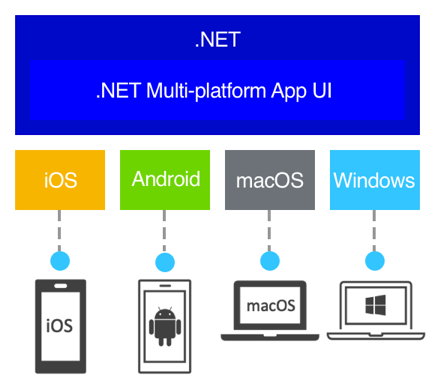
.NET MAUI is open-source and is the evolution of Xamarin.Forms, extended from mobile to desktop scenarios, with UI controls rebuilt from the ground up for performance and extensibility. If you've previously used Xamarin.Forms to build cross-platform user interfaces, you'll notice many similarities with .NET MAUI. However, there are also some differences. Using .NET MAUI, you can create multi-platform apps using a single project, but you can add platform-specific source code and resources if necessary. One of the key aims of .NET MAUI is to enable you to implement as much of your app logic and UI layout as possible in a single code-base.
SubmitForm
How To Create form Like This ?

1.Launch Visual Studio 2022. In the start window, click Create a new project to create a new project:

2.In the Create a new project window, select MAUI in the All project types drop-down, select the .NET MAUI App template, and click the Next button:
3.In the Configure your new project window, name your project, choose a suitable location for it, and click the Next button:

4.In the Additional information window, choose the version of .NET that you'd like to target and click the Create button:

in this page top of the page show imulator for run the project.
click on this
and program will be run and display the simple output.
right side of the page in solution explorer draw errows on the file.
that is program file.
about project file
in solution explorer right hand side of the page genereted some file :
what is app xaml and app xaml.cs in maui?
The first file pairing is App.xaml, a XAML file, and App.xaml.cs, a C# code-behind file associated with the XAML file. Both App.xaml and App.xaml.cs contribute to a class named App that derives from Application.
what is appsheel xaml and appshell xaml.cs in maui?
The second file pairing is AppShell.xaml and AppShell.xaml.cs, which contribute to a class named AppShell that derives from Shell.
what is main page xaml and main page xaml.cs in maui?
Most other classes with XAML files contribute to a class that derives from ContentPage, and define the UI of a page. This is true of the MainPage.xaml and MainPage.xaml.cs files.
configuration complete.
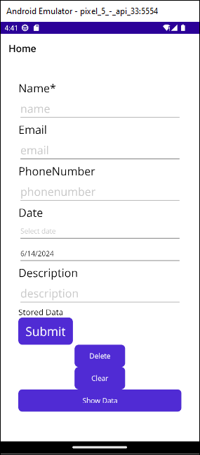
create xaml file for user interface.
Xaml:
<?xml version="1.0" encoding="utf-8" ?>
<ContentPage xmlns="http://schemas.microsoft.com/dotnet/2021/maui"
xmlns:x="http://schemas.microsoft.com/winfx/2009/xaml"
x:Class="DemoNativeApp.MainPage">
<StackLayout Padding="35">
<Label Text="Name*" FontSize="Large"/>
<Entry x:Name="name" Placeholder="name" FontSize="Large" />
<Label Text="Email" FontSize="Large"/>
<Entry x:Name="email" Placeholder="email" FontSize="Large"/>
<Label Text="PhoneNumber" FontSize="Large"/>
<Entry x:Name="phonenumber" Placeholder="phonenumber" FontSize="Large"/>
<Label Text="Date" FontSize="Large"/>
<Entry x:Name="dateofbirth" Placeholder="Select date" IsReadOnly="True" />
<DatePicker x:Name="DateOfBirthPicker" DateSelected="OnDateSelected" />
<Label Text="Description" FontSize="Large"/>
<Entry x:Name="description" Placeholder="description" FontSize="Large"/>
<Label x:Name="ResultLabel" Text="Stored Data" FontSize="16" />
<Button Text="Submit" Clicked="SubmitButton_Clicked" FontSize="Title" HorizontalOptions="Start" VerticalOptions="Start"/>
<Button Text="Delete" Clicked="DeleteButton_Clicked" WidthRequest="100"/>
<Button Text="Clear" Clicked="ClearButton_Clicked" WidthRequest="100" />
<Button Text="Show Data" Clicked="ShowButton_CLicked"/>
</StackLayout>
</ContentPage>
-create xaml.cs file.
private Database _database;
public ObservableCollection<DemoNativeApp.Model.Model> People { get; set; }
public MainPage()
{
InitializeComponent();
string dbPath = Path.Combine(Environment.GetFolderPath(Environment.SpecialFolder.LocalApplicationData), "people.db3");
_database = new Database(dbPath);
People = new ObservableCollection<DemoNativeApp.Model.Model>();
LoadPeople(); // Load data when the page is initialized
BindingContext = this;
}
private void OnDateSelected(object sender, DateChangedEventArgs e)
{
dateofbirth.Text = e.NewDate.ToString("d");
}
private async void SubmitButton_Clicked(object sender, EventArgs e)
{
if (string.IsNullOrEmpty(name.Text)||string.IsNullOrEmpty(email.Text))
{
await DisplayAlert("Error", "Please Fill All Field", "Ok");
return;
}
else
{ DateTime selectedDate = DateOfBirthPicker.Date;
var person = new DemoNativeApp.Model.Model
{
Name = name.Text,
Phonenumber = phonenumber.Text,
Email = email.Text,
Description = description.Text,
Date= selectedDate.ToString("d"),
};
await _database.SaveModelAsync(person);
//await Navigation.PushAsync(new DisplayData());
//await DisplayAlert("Success", "Person saved successfully", "OK");
//ClearForm();
// Load your data here
List<Model.Model> loadedData = await LoadPeople();
// Navigate to Page2 and pass the loaded data as a parameter
await Navigation.PushAsync(new DisplayData(loadedData));
await LoadPeople();
ClearForm();
}
}
private async void ClearButton_Clicked(object sender,EventArgs e)
{
ClearForm();
}
private async void ShowButton_CLicked(object sender,EventArgs e)
{
List<Model.Model> loadedData = await LoadPeople();
await Navigation.PushAsync(new DisplayData(loadedData));
}
private async void DeleteButton_Clicked(object sender, EventArgs e )
{
var delete = await _database.GetPeopleAsync();
foreach (var dlt in delete)
{
await _database.DeleteModelAsync(dlt);
}
await DisplayAlert("Success", "Data Successfully Deleted", "Ok");
LoadPeople();
}
private async Task<List<Model.Model>> LoadPeople()
{
var people = await _database.GetPeopleAsync();
People.Clear();
foreach (var person in people)
{
People.Add(person);
}
return people;
}
private void ClearForm()
{
name.Text = string.Empty;
phonenumber.Text = string.Empty;
email.Text = string.Empty;
description.Text = string.Empty;
dateofbirth.Text = string.Empty;
}
}
}
First Database Connectivity
=>Submit Button Event()
in this event fetch data from the xaml file.and after validation,data store into database.
and then,get data from database and navigate to second page displaydata.cs.
Clear Button Event()
call clearform function in this event .
which clear form data on button click.
Show Button Event ()
on show button click navigate displaydata(xaml) page.
Delete Button Event()
delete all records from the database.
DisplayData.xaml is new content page like mainpage.xaml and mainpage.xaml.cs.
if you want to add this page in solution explorer,right click on the project name then add.
after click on the add button show list of differnt page.
you click on the any page which you want to add.
DisplayData.xaml:
namespace DemoNativeApp;
public partial class DisplayData : ContentPage
{
public DisplayData(List<Model.Model>models)
{
InitializeComponent();
BindingContext = models;
}
private async void OnBackButtonClicked(object sender, EventArgs e)
{
await Navigation.PopAsync();
}
}
Fetch data from xaml.cs file and display in displaydata.xaml(view) page.
DisplayData() constructor get data from xaml.cs file.
and show on view.
onbackbuttonclicked event used for back on to home page.
Built-in Components
-
Controls: MAUI provides a variety of built-in controls for creating user interfaces. These include:
- Button: For creating clickable buttons.
- Label: For displaying text.
- Entry: For single-line text input.
- Editor: For multi-line text input.
- Image: For displaying images.
- CollectionView: For displaying a collection of data.
- ListView: For displaying a scrollable list of data.
- Picker: For selecting a value from a list.
- Slider: For selecting a value from a continuous range.
- Switch: For toggling between on and off states.
-
Layouts: MAUI provides several layout components to organize UI elements:
- StackLayout: Stacks child elements vertically or horizontally.
- Grid: Organizes elements in a grid with rows and columns.
- AbsoluteLayout: Positions elements using absolute coordinates.
- FlexLayout: Aligns elements based on the flexible box model.
-
Graphics and Drawing: MAUI includes tools for drawing shapes, paths, and other graphical elements.
- Shapes: Ellipse, Line, Polygon, Polyline, Rectangle.
- Paths: For defining complex shapes using path data.
-
Navigation: Tools for navigating between different pages and views within the application.
- NavigationPage: Provides a navigation stack for navigating between pages.
- Shell: Simplifies the creation of complex navigation structures and applications with flyouts and tabs.
-
Data Binding and MVVM: MAUI supports data binding and the Model-View-ViewModel (MVVM) pattern to separate UI logic from business logic.
- Binding: Mechanism to bind UI elements to data sources.
- Command: Mechanism for handling user interactions through commands in the ViewModel.
Third-Party Components
Third-party components are additional libraries and tools provided by the community or commercial vendors to extend the functionality of MAUI applications. These components can include:
-
UI Components: Enhanced or custom controls that provide additional functionality or better performance.
- Syncfusion: Offers a wide range of UI components like charts, data grids, and schedulers.
- Telerik: Provides UI components such as charts, calendars, and data visualization tools.
-
Libraries: Additional libraries that provide functionalities not covered by the built-in components.
- Prism: A framework for building maintainable and testable XAML applications using MVVM.
- ReactiveUI: A framework for building reactive applications using the MVVM pattern.
-
Plugins: Extensions that provide specific functionalities such as accessing device features.
- Xamarin.Essentials: Provides cross-platform APIs for device features like accelerometer, geolocation, and secure storage.
- Community Toolkit: A collection of reusable elements for application development including behaviors, converters, and effects.
-
Themes and Templates: Pre-designed themes and templates to enhance the visual appearance of applications.
- Grial UI Kit: A collection of pre-designed screens and templates for building visually appealing applications.
Usage
To use built-in components, developers simply reference them directly in their XAML or C# code. For third-party components, developers typically need to install the corresponding NuGet packages and include the necessary namespaces in their project.
comments powered by Disqus
Join Our Community
Join Our Community Become a part of our developer community. Share your projects, get feedback, and collaborate with like-minded individuals.
Your contributions help us continue creating valuable content. Consider supporting us by sharing our content.
Junagadh, Gujarat
Latest Blog Posts